Stupid by design

We have an outdoor light fixture, mounted above our garage door. It’s both light and motion sensitive. This means that the light turns on, at a dim level, each day around dusk. If it detects any motion nearby, it bumps up to a brighter illumination. Around dawn, the light goes off again. This are exactly the features we wanted — and the light has functioned well for more than seven years.

I say all this at the outset because, despite where this article is about to go, I don’t want to create the impression that the light fixture is a piece of junk overall.

The problem I had with the light is one that it shares with a disturbingly large number of other objects and devices: There is an aspect of design that is so mind-numbingly stupid, you have to wonder if anyone at the companies that makes the devices ever actually test them out.

In the case of the light fixture, here’s what happened:

A few months ago, one of the fixture’s two bulbs died. I got out my stepladder, climbed up to reach the light and attempted to remove the dead bulb. As it turned out, there was a metal ring that surrounded the front of the bulb casing, holding a glass cover in place. I needed to remove the ring in order to access the bulb.

This would have been quite simple to do, except for one thing. The ring was held in place by a small screw. As later became apparent, the screw is completely unnecessary. Even without the screw, the friction and threading forces holding the ring to the casing are sufficient so that the ring would never unintentionally move or fall off. At best, the screw serves as a final trivial layer of protection. However, with the screw in place, it was impossible to remove the ring. The screw had to be removed.

Making matters worse (much worse!), the screw itself was extremely small — so small that none of the screwdrivers in my toolbox had a small enough blade to fit. I had to locate the drivers I use for eyeglass repairs and computer equipment to find one that was potentially small enough.

Still, the trouble was not over. In what I can only assume was the work of a sadistic designer, the screw was recessed inside a hole, a hole barely larger than the screw itself. This meant that most of my super-small screwdrivers were still not small enough to insert in the hole and reach the screw head.

After a period of trial-and-error, I finally found one driver that seemed ideal. It fit in the hole, inserted into the screw head and was capable of turning the screw. Except it didn’t.

What was the problem now? After years of being outside and exposed to the elements, the screw had corroded. This might have been avoided if the manufacturer had used stainless steel screws, but they didn’t. No matter how hard I tried, the screw would not budge. I was in danger of stripping the screw if I kept trying.

I got out my trusty WD-40. To no avail. I went to our local hardware store and asked for advice. They recommended a rust-penetrating spray that was supposedly much better than WD-40 for this problem. Again, to no avail. The light fixture remained impenetrable, silently taunting me.

I was literally “screwed.” I have another phrase I use to describe this situation: “stymied at step one.” Whether I’m trying to assemble a piece of furniture, configure some new electronic device or (in this case) do some minor maintenance, I get out the instructions and the very first step appears impossible to do. Infuriating.

I finally gave up on the light fixture and called for reinforcements — a “handyman” that I periodically recruit for jobs that seem beyond my pay grade. Much to my surprise, he was ultimately just as stymied as I was. After about 30 minutes of trying and failing to remove the screw, he told me it would be cheaper and faster to buy a new light fixture and have him install it — rather than pay him to continue to try to extract the immovable screw. As a bonus, with the new fixture, I would have all new components, making it less likely that other repairs would be needed anytime soon.

Although I felt like I was admitting defeat, bested by an inanimate object a few millimeters in size, I agreed.

I was able to buy what appeared to be a slightly newer version of the exact same fixture I had purchased years ago. It did have one significant difference: the infamous screw was now noticeably larger and was no longer recessed in a hole. Its head sat above the ring’s surface. As you might guess, this made it much much easier to access and remove the screw. Although I could have left it in place, I was taking no more chances. I removed the screw and tossed it. It would never be able to stymy any future maintenance.

Several weeks have now gone by. The new fixture is working well and the ring remains in place.

As I reflect on this (and similar other) incidents, the same question keeps recurring: How could the company that made the object have made such a stupid design decision? If I were examining a test version of the fixture, I would have immediately spotted the difficulty with accessing the screw. And I don’t design light fixtures for a living. Did anyone at the company bother to check how hard it would be to remove the screw? Did they even care?

Cynics may claim that the design is a deliberate strategy, with a goal (successful in my case) of getting the owner to buy a new fixture rather than replace the bulb. I’m skeptical of this. If that were true, they would not have redesigned the fixture in the newer model. Rather, it seems more a case of negligence and ineptitude. Rather than take the time to worry about these matters, it’s easier and probably cheaper for them to make stupid decisions and solve any problems after-the-fact, if at all.

Screwed at any size

As it turns out, problems with screws and bolts and such can occur no matter what their size. At the other end of the size spectrum, consider the recently discovered problem with new eastern span of the San Francisco-Oakland Bay Bridge. Scheduled to open this Labor Day, after more than 10 years of construction, Caltrans acknowledged last week that “one-third of the threaded steel rods used to bolt down two massive steel boxes below the new bridge deck” had snapped when tightened.

That would be bad enough. What makes matters much worse is a “design” issue: “The failed rods, which are up to 17 feet long, can’t be replaced easily as there is no longer room to put in new ones because the bridge’s roadbed has already been installed. Engineers will have to fashion a fix.” More precisely, the access opening to the bolts is about five feet in diameter, but the bolts themselves are wider than that. Oops.

Stupid by (web) design

These sort of problems are by no means restricted to hardware. If you use a computer, you likely confront such issues on a regular basis. Hardly a day goes by that I do not curse out some website. In one case, I was promised a price reduction if I redeemed a code. Unfortunately, I reached the point where the site asked for my credit card information and instructed me to click Purchase Now — without any opportunity to enter any sort of code. If I clicked the button, I feared I would be charged the full price.

As it turns out, the redemption box does appear, but only after you click the purchase button. I had to call the company to find this out (as I was unwilling to click to purchase before I knew I would get the discount). Again, I have to wonder, did anyone at the company walk through this purchase procedure before the site went live? Did it not occur to anyone that this sequence might cause a purchaser to hesitate and ultimately not buy their product? I guess not. It’s just another example of “stupid by design.” One too many.

Win at Letterpress: Start Second, Finish First

I like Letterpress. A lot. In fact, it is my favorite new game since Angry Birds. For me, it is a nearly perfect merger of my dual interests in word puzzles and strategy board games. My hat is off to developer Loren Brichter for creating this delightful app.

I’m not going to review the basics of the game here. I figure that, if you don’t already know how to play, you’re not going to be reading this article anyway. If you do prefer a review of the rules and essential strategy, I highly recommend Josh Centers’ Letterdepressed in Marco Arment’s The Magazine.

My focus here is on how to play when you go second after your opponent has made a great opening move. In this regard, Josh Centers writes:

The first move in Letterpress confers a huge advantage. A well-played opening can devastate your opponent. If you’re opening the game, always defend a corner letter and make the longest word you can.

If you play following an opponent’s really great opening, you’re at a disadvantage, but not an insurmountable one. Like Microsoft in the ’90s, you want to “embrace and extend.” “Embrace” the opponent’s letters by using as many as possible, and “extend” by using unclaimed letters, preferably taking another corner as you do so.

However, the current first-mover advantage might be short lived. Developer Loren Brichter told me that he’s considering adding a “pie rule,” which would allow the second player to veto the opening move.

While Josh acknowledges that a great opening is not an “insurmountable” advantage, it sure comes close to sounding like one. If not, Loren wouldn’t be considering a “pie rule” (which I hope he doesn’t do). While it’s certainly an advantage to go first, I wouldn’t be too concerned — no matter how big the advantage seems.

I have currently won my last 60+ games. In almost two-thirds of those games, I played second — usually after my opponent got off to a solid start. Yet, in every case, I won.

There’s no big secret to how to do this. Essentially, I followed the advice outlined in the quote above. However, going from abstract advice to practical implementation may prove a bit tricky. That’s where a game replay can help.

What follows is a move-by-move analysis of a tightly fought game, explaining the thinking and strategy that went behind each move. I also include briefer analyses of two other games. My hope is that these annotated replays can help develop your own skills.

Game 1

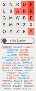
As the figures below do not include every move of the game, you should ideally follow along with the full replay of the game.

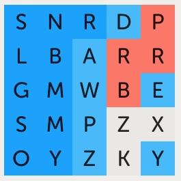
Move 1. My opponent opens with the word DRAPERY, leaving the strong position shown in the figure below.

Game 1-1

She has solid control of the northeast corner, with two protected (dark red) squares.  It’s an especially strong start because the corner contains the letters d, r and e. These are desirable letters to re-use for long words — as they form the suffixes -er and -ed. For example, you could turn a word like SLAM into (with the second M) the much better SLAMMED or SLAMMER.

After a start like this, I assume the corner (perhaps 6-8 squares) will still be in my opponent’s color at the end of the game. I may be able to do better, but I don’t count on it. The good news is that, even with the corner lost, I can still theoretically win by at least 17-8. Accomplishing this, however, will require playing catch-up for most of the game and being very careful not to make mistakes. One or two, even minor, errors can quickly turn a disadvantage into a sure loss.

Move 2. I give a great deal of thought to my first move. Unless an obviously great word presents itself, I typically spend more time on my first move than any two or three moves for the rest of the game.

When playing second, I do my best to have my move accomplish two goals simultaneously: (1) Force my opponent to defend their advantage and, if possible, (2) establish a corner of my own. Ideally, this requires my opponent to fight back on two fronts. By continuing this dual pressure over several turns, I hope to eventually build an advantage while limiting the ability of my opponent to expand their lead.

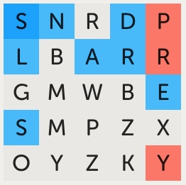
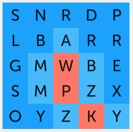
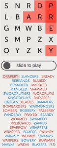
After I play SLANDERS

I attempted to accomplish this goal in this game with the word SLANDERS. It gave me the desired foothold in the northwest corner plus turned every light red square in the northeast corner to blue. Perfect!

Moves 3-5. My opponent came back with BREADY. This looked pretty good; it re-established her control of the NE corner, even extending it a bit. However, it failed to undo my NW corner foothold. This was a significant oversight in my view— and I quickly took advantage of it.

My opponent would have likely done better if she had played BLANDER. This would have had the added bonus of turning the N and L in my corner to red, forcing me to work much harder for a good reply move.

I played REBRANDS. This turned almost the entire top two rows to blue, including extending my dark blue squares from one to three. It also attacks the NE corner again. Overall, a very good move.

I was almost sure my opponent would come back with BRANDERS, using the exact same letters in a different word. However, since the SNR squares were now dark blue, playing them would not help her. As such, I thought I would still be ahead after the exchange. Not a great exchange for me, but the best I could see at the moment.

As it turned out, it didn’t matter, as my opponent played BLARED.

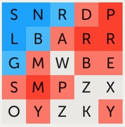
Moves 6-10. With BRAMBLED, MARBLED and MANGLED, we are pretty much treading water. I gain some traction with my move and my opponent reverses the gain with her move. When she played SPAMMED, I began to feel some additional heat (see figure). By moving into the southwest corner, especially by protecting the M, she was threatening to obtain control of the entire corner region. If she succeeded, she would almost certainly win the game. I was in trouble.

After my opponent plays SPAMMED

After much experimentation, I came up with SWORDPLAYERS. It accomplished my ongoing key goal of simultaneously attacking and defending. In particular, it protected the O (now dark blue) in the SW corner, thereby removing the danger at least for the moment.

Moves 11-15. My opponent came back strong with WORDPLAYS, using most of the letters I had just played. I returned the “favor” by playing SWORDPLAYS.

At this point, all the squares in the first two columns are blue except for the two M squares. If I could retain the eight blue squares plus add the two M squares, the entire first column would be protected (turn dark blue). More often than not, this translates into an unstoppable win. Would my opponent play a word that allowed me to do this?

She played BADGERS, an excellent comeback. It stopped me in my tracks. She attacked the G and S in the first column plus protected the M. Not at all what I was hoping to see.

I believed my opponent now had the lead. In fact, if it were possible to switch sides here and my opponent asked me to do so, I’d probably say yes.

The best I could think of for my next move was BADGES, duplicating the letters of her just-played word except for the R. For obvious reasons, I never like playing a word inferior to what my opponent just played. However, in this case, as all the R squares were either blue or dark red (protected), playing one of them would have made no difference in the position.

My opponent came back with BLADES. This was a huge error, in my view, because it left the first two columns exposed.

I believe my opponent would have done better had she replied with DEBAGS (using the same letters as BADGES) or even BARGED. Either of these would have kept an M protected.

As it stood, I at last had my chance to protect the entire first column — if I could come up with a word that used B, M, M and S.

Moves 16-20. At move 16, I played BAMMERS. I wasn’t even sure it was a word when I submitted it. But it is, because Letterpress accepted it. Bingo! For the first time, I had confidence that I would wind up winning the game. I would now be able to go on the attack more, with my opponent being on the defensive.

With BOMBARDERS, WARMONGERS, and SOMBER, we spent more time treading water. I tried to solidify and expand my western wall. My opponent tried to stop me.

At move 20, I had a major decision to make. I could have probably quickly finished and won the game, by playing a word like DAZZLERS. This would have turned both Z squares to blue and given me possession of the first three(!) columns. In retrospect, I believe I should have done exactly that.

After I play ROBBERY

However, I was greedy. I was now thinking not only about winning, but about winning with a crushing margin of victory (not very friendly, I know). So I instead went with ROBBERY. This turned every light red square on the board to blue, leaving my opponent with just the three (previously all dark) red squares in the NE corner. This seemed a potential crusher, but I was wrong.

By the way, I wasn’t worried about my opponent filling in the four unclaimed squares with a word that would end the game and give her a victory. I am almost certain that there isn’t any word that contains Z, Z, X, and K — certainly not one long enough to give my opponent a win. Having the unclaimed letters be uncommon ones was working to my advantage here.

Moves 21-25. With PASSERBY, my opponent gave me unanticipated trouble, causing me to regret my previous play. By turning the Y to red, my previously protected O in the SW corner was in jeopardy. My next word would need to include a Y, in order to re-protect the O. I had not expected this. So I played PANDERLY. With PRAYED, and BEARDY, we see-sawed again.

My opponent then gave up going after the Y square and played WORMED. I’m not certain whether this was a mistake or not. But it gave me the opportunity to go on the attack again.

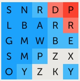
Moves 26-30. I went with SWAMPED, bringing me back to about the same place I was after playing ROBBERY. My opponent played PREBOARDS, again leaving the Y untouched. I was now ready to pounce. I played ZAPPED, at last gaining possession of the three left columns.

After I play ZAPPED

If my opponent had any chance of winning, she lost it with SPARROW. With this word, she gave up control of the P in the NE corner, the location she had guarded since her very first move. Although there weren’t any great choices for her, this was perhaps the worst one. I can only assume the move was a mistake; she failed to see the consequences until after she had played. It happens.

I countered with WRAPPERS, leaving a score of 21-1.

Moves 31-end.  The next several moves are relatively uninteresting — with the two of us exchanging similar words such as SWAMPY and SWAMPS. Essentially, I am jockeying for a maximum win position, while my opponent is trying to hang on to as many squares as she can. With BOXERS, I claimed the X. With MAWKS, I claimed the K. The game was about to end.

After I play BLAZERS, victory!

My opponent responded with WREAK. I was surprised. I thought she would play a word with Z, finishing the game even though she would lose. Instead, she left me to finish the game with BLAZERS — handing me a 22-3 victory.

Game 2

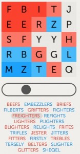
This second game demonstrates the same principles. Here, my opponent starts off with the NW corner and retains it till the end. I initially fight back by gaining control of the SW corner (see figure below). As the game develops, the outcome hinges on who will eventually possess the eastern end of the board. That turns out to be me, and I win 17-8.

After my opponent plays FREIGHTERS

Game 3

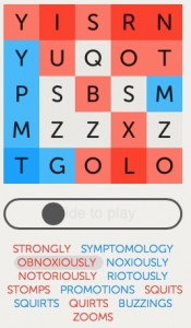
The third game is the shortest of the trio, lasting only thirteen (13) moves. Here, my opponent starts out with STRONGLY, grabbing the NE corner. She will never lose it. I thought I had a near-devastating first move reply with SYMPTOMOLOGY. However, she completely turned the game around with OBNOXIOUSLY (see figure below). Suddenly, I had the sinking feeling that the game might already be lost. Still, I fought on and came back with some good replies of my own. Despite some strong play from my opponent, I was able to secure a 16-9 win.

After my opponent plays OBNOXIOUSLY

Bottom Line

Playing the longest word you can is typically a fine thing to do. Choosing a word that turns the most amount of your opponent’s squares to your color is often a better, quite excellent, thing to do. But neither of these things, by themselves, are sufficient to win consistently. I have seen many boards where one player owns almost all the currently claimed squares, yet winds up in a hopelessly lost position within the next move or two.

The key to winning is to figure out the strategically best squares to claim and figure out the word that best acquires them. In that regard, I often start a turn by selecting six or so squares that I would most like to acquire. I then see what words I can construct that include those letters. Take your time here. Don’t rush to make a move you will regret.

How do you know which are the best squares to claim? This requires an ability to look ahead and see the consequences of your move and the possible retaliatory consequences of your opponent’s next move. Hopefully, this article provides some insight on how to do this. I plan to write additional articles that explore this further, going back to some of the basics. Beyond that, the best way to learn is to play the game.

The Punctuated Equilibrium of Macworld | iWorld

Appalooza at MacworldYears ago, Stephen Jay Gould put forward a new twist on how species evolved over time. Called “punctuated equilibrium,” the essential notion is that changes in species characteristics most often occur in small increments spanning long periods of time. However, on rare occasions, typically due to some major upheaval in the environment, a period of (relatively) rapid change may occur. As a species “scrambles” to adapt to the radical changes in its environment, the most frequent result is either the emergence of a new species and/or extinction of the old one.

As I ponder the evolutionary path of Macworld Expo (now Macworld | iWorld), the concept of “punctuated equilibrium” strikes me as a perfect metaphor.

From the very first Expo back in 1985 until the ones held just a few years ago, Macworld was the epitome of evolutionary stasis. Certainly, there were ups and downs. The Expo expanded (occupying all of Moscone North and South at one point) and contracted, locations moved and were sometimes eliminated altogether (see: East Coast Expos). Still, if you attended an Expo in 2008, the overall format, the “look and feel” of the show, was quite similar to what it was decades earlier. The changes were overall small in comparison to what remained the same.

All of this ended in 2009, due to a convergence of two cataclysmic events.

The first event was one that had been brewing for more than a decade but finally exploded in the mid-2000’s: the rise of the web. With companies hawking their wares on websites, they no longer saw a need to fork over the bucks for a huge trade show booth. Additionally, companies no longer timed the release of their new products to coincide with a big trade show announcement. The result: smaller shows with almost nothing truly “new” on display. This led to a contraction, and ultimately an elimination, of many trade shows (CES remains an exception to this rule). For a time, Macworld held up against this tide, thanks to the re-ascendance of Steve Jobs as CEO and, a bit later, to the popularity of Apple’s iPod. But, by the latter half of the decade, even as Apple’s stature skyrocketed with the release of the iPhone, Macworld Expo was feeling the downward drag of this “web effect.”

The second event was Apple’s departure from the Expo in 2010 (Steve Jobs last appearance was actually in 2008). This put Macworld Expo in a perilous tailspin. Almost all major vendors deserted the show floor. Attendance dropped precipitously. Almost everyone was speculating how long it would be before the Expo went “extinct” altogether.

In other words, the Expo had gone from stasis to disruption. The equilibrium had clearly “punctuated.”

Today, after 4 years of scrambling to reinvent itself, a new Macworld has emerged. It was actually first seen last year. Almost entirely abandoning the idea of Macworld as an industry trade show, it became the “ultimate iFan event,” a consumer-oriented celebration of Apple’s products — and the peripherals, software and people that support them. Recognizing the overriding importance of Apple’s mobile “i” products, Macworld Expo also changed its named, rebranding itself as Macworld | iWorld.

And it worked. The new show is smaller, with a very different feel than the ones that came before. But it is successful.

Attendance this year remained healthy (even if my rough estimate suggests it was a bit less than last year). Vendors were generally giddy with excitement at how much traffic they saw at their booths. Several vendors that I asked were all or nearly all sold out of everything they had brought to sell at the show.

The Tech Talks were as strong as ever (disclaimer: I gave one of these Tech Talks). The events on the Main Stage and in the hallways struck me as even better than in years past.

Most noteworthy, the format of this year’s Expo was an almost identical match to that of last year.

In other words, the disruptive period of Macworld Expo evolution appears to be coming to end. Instead, we are now entering a new period of stasis which (if you enjoy Macworld as much as I do) will hopefully remain for the foreseeable future.

Trending topics…

For the past several years, hardware products have not dominated the show floor. That’s not exactly true. If you wanted to see iPhone/iPad cases or coverings of any sort, from the practical and useful (such as iPad cases with keyboards) to the silly and pretty useless (such as iPhone cases with can openers), they were there in abundance. The same was true for other i-accessories, from batteries to camera lenses. To me, the silly and nearly useless products too often outnumbered the practical and useful ones. Happily, the ratio was significantly more favorable this year. There was actually innovative hardware on the floor.

If you check out Macworld’s Best of Show awards, you’ll get a feel for what I mean. Seven out of the nine winners went to hardware products.

Among my personal favorites at the show were Kanex’s mySpot and meDrive, Seagate’s Wireless Plus drive, Hyper’s iUSBport, and Connected Data’s Transporter. All of these represent new wireless methods of storing and accessing data. This is definitely a growing trend. I’m certain this category will expand further by next year’s event. I was also glad to see the ScanSnap iX500 document scanner (a product I raved about in a review prior to the Expo).

As for software, the Appalooza section of the floor combined both iOS and Mac products. It was an eclectic collection, not really representative of the biggest and most popular products (most of whom did not have a booth). But it was still interesting and fun to browse through. I was most intrigued by several “new” entries — Cloak (a consumer-friendly VPN service), CleanMyMac 2 (an update to a cleaning app that looked good enough to actually risk using on my drive), JPEGmini (an app that appears to greatly reduce the file size of images without a loss of image quality) and two great magic apps for the iPhone from Rostami (iForce and iPredict+). I hope Appalooza is even bigger next year. Good inexpensive software is always a crowd-pleaser.

Top 5 Apple Stories of 2012

It’s that time of year again. A time to look back at the most significant Apple-related news stories of the year. As I did last year, I’ve selected my choice of the top 5 stories, “reflecting both the ups and downs of Apple’s year, with a bias towards the up.” I’ve also included two honorable mentions for noteworthy stories that didn’t quite qualify for a 2012 award. Let the countdown begin…

5. Mountain Lion: The iOS-ification of OS X continues

On July 25, Apple released Mountain Lion, the newest version of OS X for Macs. As Apple releases a new version of OS X every year, this isn’t big news by itself. What made Mountain Lion special was its emphasis on “iOS-ification.” This is a trend that began with Lion in 2011, but really took off with this year’s OS X update.

A look at Apple’s What’s New webpage for Mountain Lion reveals that almost every listed item is either an iOS feature imported to the Mac (Reminders, Notes, Messages, Notification Center, Game Center. Tweet from apps) or is designed to for improved interplay between iOS devices and Macs (iCloud, AirPlay). Given that iOS devices now represent the lion’s share of Apple’s revenue, this shift makes sense.

Overall, these new features are an improvement compared to how similar tasks were handled in Lion. Still, there is concern about the end game. Will OS X continue to evolve to a more iOS-like environment? Will this ultimately mean a simpler, more user-friendly Mac — one that has the bonus of effortlessly working with iPhones and iPads? Or will OS X emerge as a dumbed-down, sandboxed OS that leaves users frustrated with a host of iOS-derived restrictions and prohibitions? The answer should become clearer with the expected release of OS X 10.9 in 2013.

4. iPhone 5: Hello gorgeous!

The iPhone 5 is a knockout. Plain and simple. It improved on the previous generation of the iPhone in every aspect that matters: a larger 4″ screen, LTE support, a faster A6 processor, and an even better camera.

iPhone 5 with Maps

Plus, with its sleek thin design and metal back, it is the best looking iPhone ever. To top it off, it weighs no more than a feather (okay, two feathers).

While there has been grumbling about having to shift from the 30-pin Dock connector to the new Lightning connector, this was a necessary change. Once the period of transition is over, even Lightning will be viewed as an asset.

Competition from Android smartphones has been intense over the past year. Apple needed the new iPhone to be a big deal. It was. And it still is.

3. MacBook Pro with Retina Display: Seeing is believing

When Apple unveiled the 15-inch MacBook Pro with Retina Display last June, the consensus (as typified by John Gruber) was that it was the “best computer Apple has ever made.” Later in the year, Apple added an equally impressive 13-inch Retina display sibling.

Why are these laptops such a big deal? The answer can be summed up in two words, words that are part of the name of the devices: Retina display. Once you spend time with these displays, you will be hard-pressed to go back to anything else. To describe the display as gorgeous is an understatement. Text seems as if it were inked on by some calligraphic process; there is no hint of pixelation. Photos pop out with a startling brilliance.

That’s not all. Although not quite as thin as the MacBook Air, the Retina display notebooks are still thinner and lighter than any previous MacBook Pro. Like the Air, they feature super-fast and reliable SSD storage. And consistent with where Apple sees the future heading, these Pros no longer have an optical drive.

These MacBooks are the blueprint for Apple’s future laptops over the next couple of years. No other computer company has anything that can compete with them. And that’s why they are on the Top 5 list.

2. iPad mini: Smaller makes it bigger

Steve Jobs famously dismissed the idea of a 7-inch iPad as “too big to compete with a smartphone and too small to compete with an iPad.” The public disagreed. Conceding to the public’s appetite, Apple announced the iPad mini back in October. It was the right move. Since then, Apple has been unable to keep up with demand. It’s been a run-away hit, likely at the forefront of what will be a blockbuster holiday season for Apple.

The mini doesn’t break ground with new features. In fact, in some ways it is a step backward — especially as it lacks the Retina display of the larger iPad. But what it lacks in new features it makes up for with its primary reason for existence: a smaller size. With the growing popularity of super-large smartphones and 7-inch tablets, it was clear Apple needed a competitive entry in this market. The iPad mini is Apple’s answer.

Most reviewers admired the more compact size of the mini, with its ability to easily hold the device in one hand. In general, the smaller display size was not viewed as problematic for working with iPad-optimized apps. Many mini users expect to switch from the larger iPad to the mini as their main tablet. Indeed, pundits predict that the iPad mini will eclipse the larger iPad in market share by the end of 2013.

1. Maps: Apple’s sense of direction falters

At the start of 2012, I would never have guessed that an iOS app category would emerge as the top story of the year. But it did. Maps is not just any ol’ app category. It may be the single most critical app on an iOS device. Not only is it one of the most frequently used apps — but with its ability to locate nearby places of business and other points-of-interest, it is an important indirect source of revenue for many companies. Whoever controls the default maps app controls a key portion of iOS.

That’s essentially why Apple was increasingly uncomfortable with the fact that Google was the developer behind the Maps app for iOS. And that’s what led Apple to replace it with their own in-house version of Maps, introduced as part of iOS 6.

It was not a smooth introduction.

It turned out that Apple’s Maps app had accuracy issues, too often leading to a “wrong” destination. Complaints from users quickly became front page news. In a rare move, Apple was forced to issue a letter of apology, where it suggested alternative mapping apps while Apple worked to improve its own app. Complicating matters further, Scott Forstall (head of iOS software development) refused to sign the apology statement, which became a precipitating factor in his being fired from Apple.

Mapping again made news when an updated version of Google’s Maps app returned to iOS in December. The new version was better than ever — including Google offering turn-by-turn directions for the first time on an iOS device. Personally, assuming both Apple’s and Google’s apps were equally accurate, I prefer Apple’s Maps overall. For one thing, I find it easier to set up a route with it. However, Google’s app offers the plus of transit directions. In the end, the battle between the two apps a win-win situation for iOS users.

The fall-out from the Maps app controversy extends beyond the world of mapping. A few years from now, I believe it will be seen as a tipping point event that broke a long-standing magic spell surrounding Apple.

Almost immediately after the controversy erupted, Apple’s stock began a 200-point (and still counting) decline. The decline was partly attributed to the Maps business. However, other negative trends also contributed to analysts’ concerns. Most critical was increased competition in the mobile market, especially from Samsung’s Android devices. And for the first time in years, numerous articles appeared that questioned whether or not Apple had peaked.

Some analysts attributed the decline to a sell-off, prior to an expected capital gains increase in 2013. By this measure, you can expect Apple stock to go up again in January. And there is no doubt that Apple continues to rake in money on impressive sales of its devices. Still, at least on Wall Street and among many journalists, there has been a negative shift in the mindset towards Apple. The ultimate fate of Apple’s stock, and Apple’s overall market dominance, remains in flux.

Honorable mentions

AirPlay: Living in the future. AirPlay has been around for quite some time. Initially, called AirTunes, it was introduced in 2004; the shift to an expanded AirPlay version occurred in 2010. While this would seem to make it ineligible for a 2012 list, I include it here because of its recently expanded capabilities, primarily mirroring. You can now mirror almost anything on a Mac or an iOS device to an Apple TV. With third-party software such as Reflector, you can similarly mirror iOS displays to a Mac.

I continue to be blown away by what AirPlay easily allows you to do. Whenever my wife asks a technology question that ends in “Can we do this?,” my answer is increasingly “Yes.” And, more often than not, the reason for the affirmative reply is AirPlay. As an example, I received some photos as text messages the other day. My wife asked if she could see them on our TV. The answer was yes. On another occasion, she wanted to watch a TV show she had forgotten to record. I found the show on the network’s website, but it could only be viewed from the web. Again, she preferred to see it on our television. No problem with AirPlay.

AirPlay is just one element of a larger trend towards more sophisticated interactions among all of our increasingly powerful technology devices. It’s beginning to feel as if we are living in the future…when the things I saw in science-fiction movies years ago are now reality. And Apple technologies, such as AirPlay, are at the forefront of this trend.

iCloud: Moving on up. This was the year that Apple terminated MobileMe and went all in with iCloud. The new service is far from perfect. I still prefer Dropbox for many tasks. But with iTunes Match, PhotoStream, Documents in the Cloud (especially when used with iWork documents), and numerous other iCloud-dependent capabilities, we are finally seeing the practical benefits of Apple-integrated cloud storage. It’s all part of a evolutionary shift, clearly endorsed by Apple, towards the cloud as the key component for the storage and manipulation of all our data. Expect this shift to accelerate in 2013.