There are numerous strategies (or “tactics” or “rules,” whatever) that can help you win Letterpress games. I wrote an article, previously posted here, detailing several such guidelines.
Once you begin to master these guidelines, the next step is to realize that there are situations where the winning approach is to ignore the conventional wisdom and make an exception to the rule.
In this article, I explore three such exceptions.
Get off the “see-saw”
In games between closely-matched opponents, the mid-game often boils down to a swinging back and forth, where the overall position remains largely unchanged. Typically, there is a “neutral zone” line of squares dividing two areas of the board, each area largely controlled by one of the opponents.
Both players naturally go after the neutral zone squares. However, as these letters are adjacent to the opposite player’s protected squares[*] and/or to unclaimed squares, there is no way either player can protect them. This means each player will, if possible, retake the lost squares on his next turn. That’s what makes it a neutral zone. Nothing much changes over a series of turns. Metaphorically, it’s like being on a see-saw.
Game 1
A good example of a see-saw situation can be seen in the game depicted in Figure 1. To replay the entire game, click here.
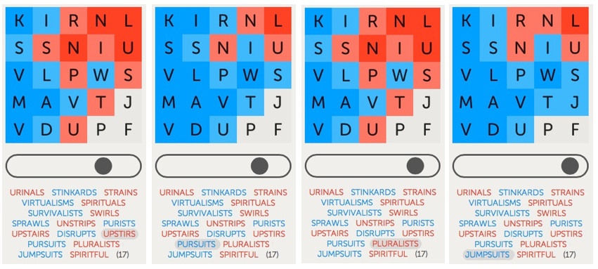 Figure 1: By playing JUMPSUITS, I got off the see-saw.
After coming up with SURVIVALISTS for my third move, I thought I had the game just about won. However, one obstacle remained. The JPF squares in the lower-right corner remained a “third-rail.” Neither of us could safely touch them. This was because: (1) there was no single word that contained all three letters and (2) playing a word that contained just one or two of the letters would allow the other player to take the remaining unclaimed square(s) and almost certainly win the game.
So, instead, we went into see-saw mode. We eventually focused on a neutral zone consisting of a vertical line of squares containing RSPTU, plus the I and the S in the last two columns. You can clearly see the see-saw effect in the sequence from UPSTIRS to PLURALISTS shown in the first three panels of Figure 1.
There are two ways to successfully get off these see-saws.
The first and more common way is to outlast your opponent. This means that you are able to come up with one more “neutral zone” word than your opponent. Once your opponent fails to match you (and thus leaves one or more neutral zone squares untouched), you take advantage by expanding your territory in the newly accessible area. Eventually, you hope to gain enough territory that you can comfortably take “third rail” letters and close out the game with an easy win. Even one misstep may be sufficient to lead to a loss; two missteps are almost certainly fatal.
This is the “conventional wisdom” strategy because it is a “safe” one in the short term: you maintain the status quo while waiting for a sure advantage. However, it contains a long-term risk: you may be the one who runs out of words first, ceding the advantage to your opponent. Since you usually can’t tell in advance which way things will go in the end, it is functionally akin to a toin-coss. Heads you win, tails your opponent wins.
I prefer better odds. That’s why, in these situations, I am always scanning for the second way to successfully get off the see-saw: Rather than wait to see who runs out of words first, be pre-emptive. Play a word that contains one or more of the “third-rail” letters and yet guarantees a quick win. The key here is knowing when this is likely to succeed.
In this game, my pre-emptive word was JUMPSUITS. This word claimed the “third-rail” J, as seen in the final panel of Figure 1. After a conventional response from my opponent, I could play a word such as SPIRITFUL on my next turn and win the game. My only concern was whether or not I would get a “next turn.” The risk here is that my opponent might come up with a word that included P and F, plus sufficient other squares, to give him an instant win. Either way, the game was going to end on the next round of play. The see-saw ride was over.
For those of you familiar with the game of Hearts, I consider this pre-emptive strategy to be somewhat similar to “shooting the moon.” If it works, you win spectacularly. If not, you lose spectacularly. That’s why you want to be confident the move will succeed before embarking down this path. However, your confidence need not reach 100% certainty to justify taking the risk — which means you may lose on occasion.
In Letterpress, before I make a pre-emptive move, I test out all the possibly dangerous return words I can think of that my opponent might play…and count out the resulting score. If any word gets him to 13-12 or better win, I abandon the move. Such an analysis can take a good deal of time, and there’s no guarantee that you will find every relevant word. You just do the best you can.
In this game, after my opponent played PLURALISTS, I looked at playing JUMPSUITS and searched for any words that my opponent could reply and get a win. I could not find any. So I went for it. It paid off. My opponent played SPIRITFUL. Close, but no cigar. He ended the game — but I still won with a score of 13-12!
Game 2
Another good example of this technique can be seen in the game depicted in Figure 2. To replay the entire game, click here.
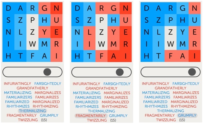
 Figure 2: By playing GRUMPILY, I got off the see-saw.
After playing MATERIALIZING on my second turn, the game had already advanced to the point that the only remaining unclaimed letters were the middle PZW squares. However, these were now “third-rail” squares. For the next several turns, neither of us would risk claiming any of them. Instead, we focused on a neutral zone that consisted of the ring of squares that surrounded these three letters. [As an aside, I did not mean to play RHYTHMIZES when I did, but that’s a story for another day.]
After I played THERMALIZING, my opponent responded with FRAGMENTARILY. Despite being a 13-letter word, it actually hurt his position overall — by leaving the H as blue. The safe move here would have been for me to respond with a word like LADYFINGERS, reclaiming all the neutral zone squares (except for the M in this case) plus extending my position by turning the now exposed G in the top row to blue. However, this would not tilt the game decisively in my favor. A prolonged battle remained likely.
So, after careful consideration, I instead chose to “shoot the moon.” I played GRUMPILY, claiming the third-rail P (as seen in the third panel of Figure 2). This also turned both the G and the U in the upper right corner to blue, as well as newly protecting the R and the H squares, leaving me with nine (9) protected squares.
I knew I could win on the next turn with any of several words that contained Z and W. Would I get that chance? Not exactly. But again it didn’t matter. Similar to Game 1, my opponent, realizing his hopeless position, fell on his sword by playing TWIZZLING. This ended the game but still left me with a 13-12 win.
Game 3
As I said, even after a thorough analysis of the position, you can still lose by going for the pre-emptive move. This happened to me in the game depicted in Figure 3. To replay the entire game, click here.
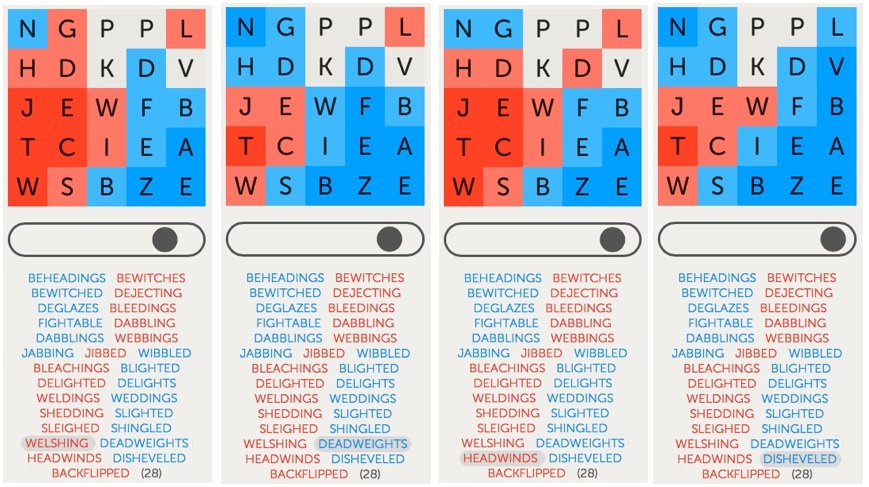
 Figure 3: By playing DISHEVELED, I got off the see-saw — and was sorry I did.
After my opponent played BLEACHINGS, I believed I would have won the game by playing BEKNIGHTED. However, I didn’t see this word until after I played BLIGHTED. This led to a see-sawing over the next several turns, involving the vertical column of GDWIS, with some looseness for control of the D and W.
When my opponent played HEADWINDS, it was the first time in this sequence that he allowed the G at the top of the second column to remain blue after his turn. This gave me what looked like a potential opening for a quick pre-emptive win.
I did consider the “conventional” safe moves of either SANDWICHED or BANDWIDTHS. As things turned out, I wish I had played one of those words. Even though this would have maintained the see-saw, I stood a good chance to win in the end.
But I did not know how things would turn out. So I instead played DISHEVELED, finally claiming the V, one of the 4 “third-rail” letters. I had spent a good deal of time checking out the consequences of words my opponent might play. None of them led to a victory for him. However, my opponent surprised me with BACKFLIPPED, a word I had not considered. It gave him a 13-12 win. It might be the only word in the dictionary that allowed him to win. But that’s the way it goes. I still think it was worth the risk.
Despite the occasional loss, I consider the pre-emptive strategy to be one of the most important weapons in my arsenal. You won’t always have an opportunity to use it. You certainly don’t want to take such moves recklessly. But I’ve found that good opportunities come up quite often in these see-saw situations. And when you do take the risk, and it works out like you hoped, it’s a great way to win. It will certainly surprise your opponents.
Win with one corner
Conventional wisdom, as covered in my previous article, says that protecting a corner is a good thing. I obviously agree. If protecting one corner is good, it should follow that gaining possession of more than one corner is even better. Generally, this too is true.
However, the quality of a protected corner position also matters. A strong corner position is one in which you have several, say as many as 7 or 8, connected squares extending out from the corner, at least three of which are protected. A weak corner position is where you only have 1 or 2 protected squares, usually one being the corner square itself, with little or no extension.
This leads to the exception to the “rule” about corners: Possessing one strong corner can often be superior to having control of two or even three weak corners. On the surface, this might seem fairly obvious. However, you may be surprised by the extent to which this logic can apply. Sometimes, even a single fairly weak corner can be sufficient to win a game.
As an example, look again at the game depicted in Figure 3. For most of the game, I had possession of two corners, a strong one in the lower right and a weak one in the upper left. The corner in the upper left may have been weak but it was critical. If I let it go, my opponent would likely quickly gain control of the entire left side of the board and march to an easy victory. In contrast, my opponent possessed only one corner, the lower left.
By playing DISHEVELED, I gained a foothold in the upper right, giving me a degree of control in a third corner. Meanwhile, my opponent seemed to be struggling to maintain his lone corner. And yet…with his next move, my opponent went on to win the game!
Pass up a corner
Your opponent goes first and protects a corner. Now it’s your move. As I covered in my prior article, ideally you want to both weaken your opponent’s corner and establish at least one corner of your own. However, this is not always possible. Sometimes, you have to choose between these two goals. When this happens, the question becomes: which goal to pursue first?
The conventional wisdom is to prefer to set up your own corner first. I agree. The rationale is that, if all you do is weaken your opponent’s position, he can often undo your damage as well as expand his advantage on his next turn. You wind up worse off than before your move. At least, if you protect a corner, it cannot be entirely undone by your opponent in one turn.
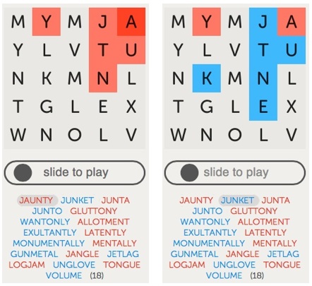
Once again, however, there are exceptions. If it looks like, left unchecked, your opponent can quickly gain an insurmountable advantage, you need to go after his corner. Occasionally, the rationale may be more subtle. For example, take a look at the game depicted in Figure 4. To replay the entire game, click here.
 Figure 4: For my first move, I decided to attack my opponent’s position rather than establish a corner of my own.
After my opponent opened with JAUNTY, I could have responded by taking the lower left corner with WANTONLY. However, this fails to touch his upper right corner. Alternatively, I could play JUNKET and dismantle his corner, but fail to establish a corner of my own. I couldn’t find a word that accomplished both goals. Which to do? In this case, I went against the conventional wisdom and opted for JUNKET.
Why? Because I knew that by playing a word with a J, my opponent would similarly have to follow with a J-word — if he wanted to continue to protect his corner. As far as I could tell, there weren’t any J-words that would allow him to improve his position significantly. So I felt safe in not establishing my own corner immediately. After he played GLUTTONY, abandoning taking a J-word, I finally took the corner with WANTONLY.
Bottom line
The “conventional wisdom” move is the one you should usually take — almost by definition. However, the common thread in all of the above games is that the best moves were ones that did not follow the conventional wisdom. The specifics of a given board position will determine when the time is ripe to make an exception. Your goal is to always be on the look-out for these “exceptional” positions. If you can reliably spot them, and take the appropriate action, you are certain to increase your winning percentage.
—————
* The term “protecting” means surrounding a square with other squares of the same color so that the square turns the darker shade. This means its blue/red color cannot change on the next turn. “Protecting a corner” or “establishing a corner” means protecting a corner square. A typical strategy is to expand this corner base, on subsequent turns, by protecting adjacent squares.
[Update: Several minor changes, for clarity, have been made since the article was first posted earlier today.]

 Figure 1: By playing JUMPSUITS, I got off the see-saw.